How Colors Influence Space Perception in Minimalist Environments
Understanding the Role of Color in Minimalist Design
In the world of minimalist design, color is a fundamental element that significantly influences how we perceive and interact with our surroundings. It extends beyond mere aesthetics; colors can dictate the mood, spatial perception, and even functionality of a space. This article examines the intricate relationship between color choices and their effects on our sensory experiences within minimalist environments, revealing the nuanced power of colors in shaping our everyday lives.
Emotional Impact of Color
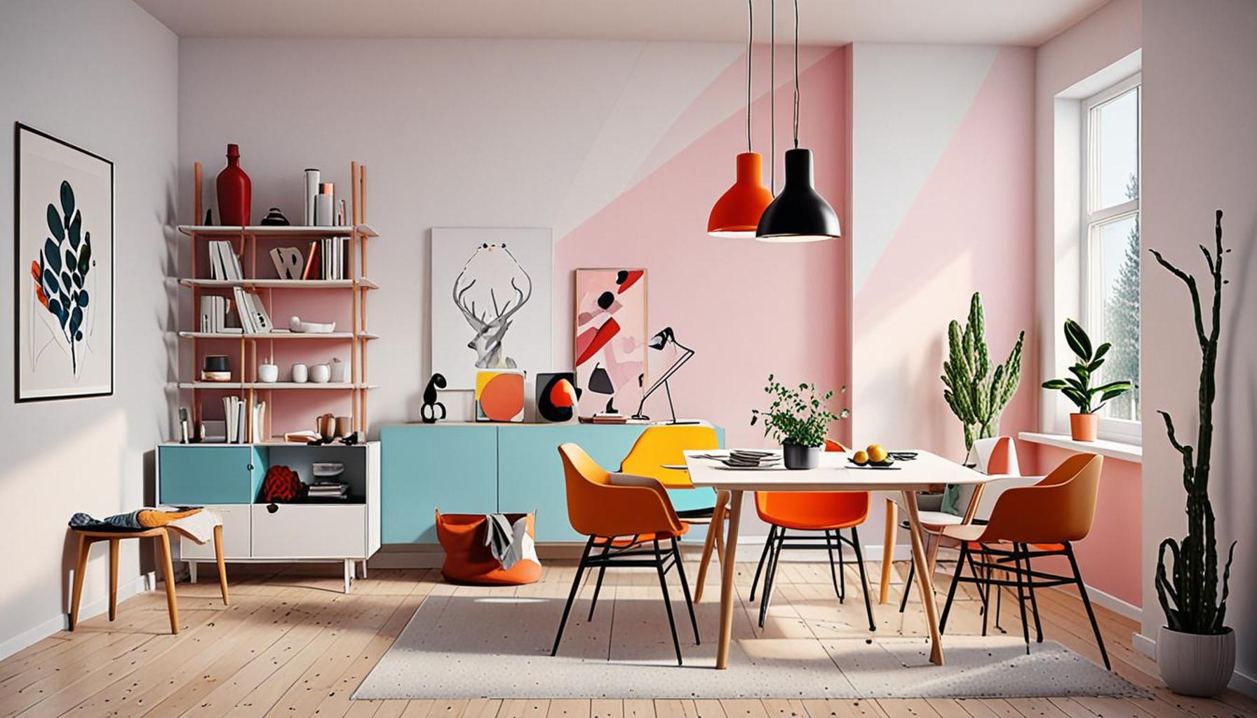
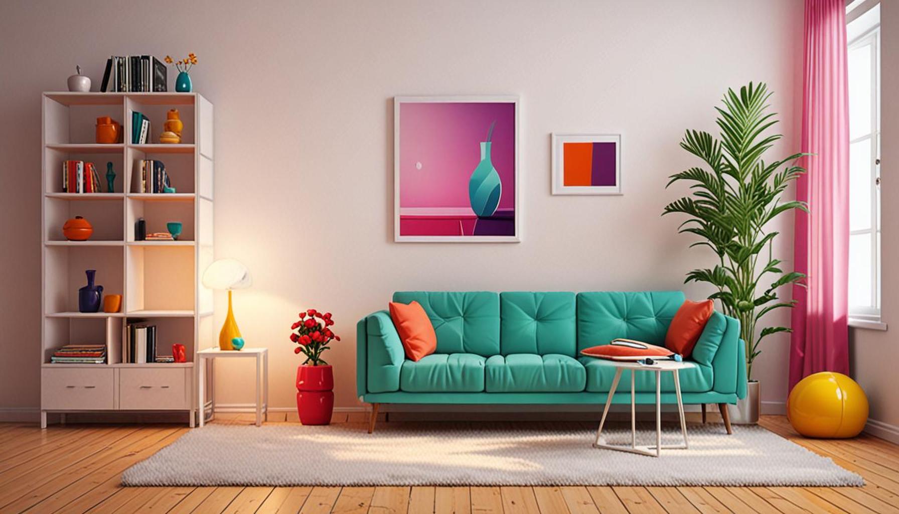
Colors wield the remarkable ability to elicit strong emotional responses. For instance, warm tones like red, orange, and yellow are often associated with feelings of energy and vibrancy. These hues are inviting and stimulate social interaction, making them ideal in environments designed for gathering, such as living rooms or kitchens. In contrast, cool shades—blues, greens, and purples—tend to evoke tranquility and serenity. These colors can create a calming refuge, making them highly suitable for bedrooms or meditation spaces. Understanding the psychological impact of color is essential for designers aiming to create spaces that resonate on an emotional level.
Spatial Awareness Through Color
Color choice undeniably affects our spatial awareness. Light colors, particularly whites and pastels, have the power to create an illusion of expansiveness, allowing compact spaces to feel significantly larger. For example, an apartment with white walls and minimal furnishings can appear more open and airy, enhancing the occupant’s sense of comfort. On the other hand, darker hues can make a large room feel more intimate, but they can also shrink the visual perception of smaller areas, transforming them into more compact environments. Thus, designers must carefully consider the impact of color on spatial dynamics when conceptualizing minimalist spaces.
Contrast and Balance in Design
Strategic color placement is crucial in achieving contrast and balance within architectural design. Utilizing a predominantly neutral palette allows for the introduction of bold colors as focal points. For example, a stark white room with a single vibrant piece of artwork or an accent wall in deep navy can draw attention while maintaining a minimalist ethos. This technique not only enhances visual interest but also guides the eye, influencing movement within the space. Elements like furniture, fixtures, and decor can be meticulously chosen in complementary or contrasting colors to further enrich the environment.
In summary, understanding the multifaceted role of color in minimalist design is crucial for creating spaces that are not only visually captivating but also emotionally resonant and functional. As we continue to explore these relationships, architects, designers, and homeowners stand to gain invaluable insights that can lead to the development of harmonious and inviting environments. More than just a visual tool, color is, indeed, a powerful element capable of transforming everyday spaces into extraordinary experiences.
DISCOVER MORE: Click here for practical tips
The Science Behind Color Perception
Color perception in minimalist environments is not just a subjective experience; it is deeply rooted in psychology and neuroscience. The way our brains process color shapes our understanding of space, depth, and even movement within environments. Research has shown that the human brain is particularly sensitive to color contrasts, which help in recognizing edges and boundaries of objects. This sensitivity can be harnessed by designers to manipulate spatial perception deliberately.
Understanding Color Temperature
One important aspect of color perception is color temperature, which categorizes colors into warm and cool spectra. Warm colors, as mentioned earlier, evoke feelings of energy and excitement, leading to a perception of closeness in a space. Conversely, cool colors create a sense of distance and calmness, potentially making areas feel larger than they are. In minimalist design, choosing the appropriate color temperature can drastically alter our experience of a space.
Impact of Lightness and Darkness
The lightness or darkness of a color can also influence how we perceive the dimensions of a room. A recent study indicates that lighter shades tend to reflect more light, contributing to a brighter atmosphere that expands our perception of space. This phenomenon can be particularly effective in smaller rooms, where light pastels or whites create an illusion of openness. On the contrary, darker colors absorb light and can make a space feel more enclosed. This knowledge can guide designers when they need to craft a minimal yet functional living space, enhancing the qualities of the area.
Importance of Color Schemes in Minimalism
In minimalist design, where the objective is to eliminate clutter and unnecessary distractions, how colors are organized can play a vital role in enhancing or suppressing the perception of space. Consider employing a cohesive color scheme, which includes:
- Monochromatic: Utilizing various shades of a single color can create a harmonious and cohesive atmosphere.
- Analogous: Combining adjacent colors on the color wheel encourages a smooth transition that can enhance the feeling of flow within a space.
- Complementary: Using colors opposite each other on the color wheel can create a vibrant contrast, drawing attention to specific elements in a minimalist setting.
Through the intelligent application of these color schemes, designers can masterfully influence space perception while adhering to a minimalist design philosophy. This approach not only emphasizes the beauty in simplicity but also manipulates the sensory experience of inhabitants, making the concept of minimalist spaces more layered and dynamic.
As we delve deeper into how particular hues and their arrangements can shape our interactions with environments, it becomes clear that color is a critical component that transcends mere superficiality in minimalist design.
| Color Psychology | Impact on Space |
|---|---|
| Warm Colors | Creates intimacy Warm colors like reds and oranges often draw spaces inwards, giving a sense of warmth but can make rooms feel smaller. |
| Cool Colors | Enhances openness Shades of blue and green can create an illusion of spaciousness, promoting tranquility while appearing to expand physical dimensions. |
In minimalist environments, color choice plays a vital role in how occupants interact with their surroundings. The interplay of color impacts not only aesthetics but also psychological well-being, making it a crucial aspect in design decisions. Utilizing light colors on walls and ceilings can amplify natural light, fostering an airy feel. This technique encourages positive feelings, reducing anxiety often associated with cluttered spaces. Additionally, incorporating neutral tones within furniture or decor can enhance harmony, providing a cohesive look that emphasizes simplicity.Furthermore, the implementation of accent colors in artwork or decor items can serve as focal points within a minimalistic framework, sparking interest without overwhelming the senses. Overall, the meticulous choice of color in such spaces offers a pathway to influence emotional responses and enhance the perception of space.
DISCOVER MORE: Click here to learn how minimalism can enhance your daily efficiency
Psychological Effects of Color in Minimalism
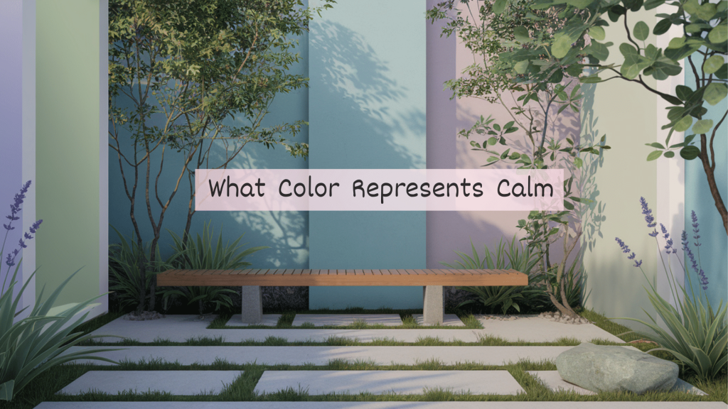
The psychological impact of color is a critical factor in how we experience minimalist environments. Colors not only affect mood but also shape cognitive responses to the space around us. According to various studies in environmental psychology, specific colors can invoke emotional reactions that influence how we perceive spatial arrangements. For instance, the color blue is universally recognized for promoting serenity, which can encourage relaxation in minimalist settings. Rooms painted in light blue or accented with blue design elements can create the illusion of a larger environment as observers are subconsciously drawn towards the calmness this color imparts.
Color Associations and Their Influence
In minimalist interiors, color associations can dictate how occupants emotionally connect with the space. The color green, often linked to nature, can evoke feelings of peace and sustainability. Environments that incorporate various shades of green can feel refreshing and open, enhancing connections with the outdoors. Integrating natural elements and organic textures alongside a green palette can blur the boundaries between indoor and outdoor, fundamentally changing our perception of the space and making it appear more expansive.
Additionally, colors can influence perceptions of safety and comfort. The use of warm earth tones such as beige and terracotta can create a grounding effect, making spaces feel more inviting despite their minimalistic nature. In contrast, stark white walls, while often seen in minimalist designs for their ability to amplify light, can evoke feelings of sterility or coldness if not balanced with other warmer accents.
Color Dynamics and Spatial Relationships
Exploring the interaction between colors can further heighten spatial perception. Utilizing different colors for various zones within a minimalist space can effectively delineate areas without the need for physical barriers, creating a sense of organization that enhances functionality. For example, using light shades for work areas and softer tones for relaxation zones can help differentiate purpose while maintaining a visually coherent environment. This technique encourages fluid movement through spaces, reinforcing the conceptual flow central to minimalist design.
The Role of Color in Light Reflection
Colors not only influence emotional states but can also manipulate light properties, significantly impacting the perception of space. Reflective colors, particularly in minimalistic choices, can expand the visual boundaries of a room. High-gloss paint finishes or strategically placed mirrors in an environment painted in lighter, reflective hues can amplify the natural light entering the space, thereby enhancing the openness and perceived volume of the area.
On the other hand, muted and matte colors can absorb light, limiting the perceived size of a room. While this can create a cozy atmosphere, it may also lead to feelings of confinement if overused. Thus, carefully balancing reflective and absorptive colors is vital in successfully managing spatial perception in minimalist design.
Color, Culture, and Individual Perception
Lastly, it’s important to acknowledge the role of cultural context in color perception. Different cultures associate various meanings and emotions with specific colors, which can greatly influence individual preferences in design. Designers must consider the cultural backgrounds of occupants to ensure that color choices resonate appropriately within minimalist environments. For instance, while white is often associated with purity and cleanliness in Western contexts, it may carry different connotations in Eastern cultures, impacting how the space is experienced.
In sum, the intricate relationship between color and spatial perception in minimalist environments emphasizes the need for thoughtful color application. By considering these psychological and cultural factors, designers can create spaces that resonate deeply with occupants, enriching their experiences while adhering to the principles of minimalism.
EXPLORE MORE: Click here to dive deeper
Conclusion: Embracing Color in Minimalist Design
As we navigate the intersection of color and spatial perception within minimalist environments, it becomes evident that the choices we make in color can have profound implications for enhancing our experiences in these settings. The intentional use of colors not only shapes our emotional responses but also facilitates the perception of space, influencing how we interact with our surroundings. The ability of hues like blue to create tranquility, green to connect us with nature, and warm earth tones to provide comfort are powerful tools for designers aiming to cultivate inviting atmospheres.
Understanding the dynamics of color—its associations, the balance of reflective and absorptive qualities, and the cultural significance attached to various shades—allows for a more nuanced approach in minimalist design. By carefully orchestrating color schemes, designers can delineate spaces without the need for physical barriers, enriching functionality and flow while maintaining harmony.
As we explore contemporary minimalist aesthetics, let us not underestimate the potency of color. It is an essential element that can redefine our perception of space, making even the simplest environments feel expansive and deeply connected. By embracing the art of color thoughtfully, we can transform minimalism into an enriching experience that resonates with its occupants, inviting them to fully engage with their surroundings in more meaningful ways.